Tuesday, May 1, 2012

Vista Sans Wood Type Project


The Vista Sans Wood Type Project was initiated by Tricia Treacy and Ashley John Pigford as a collaborative exploration of the interplay between archaic and modern technologies. The hope was for artists to create prints where the production and material is ingrained in the final products. Here's how it worked:
  1. More than 25 artists from national and international printshops agreed to participate in the project.
  2. Ashley built a CNC router and together, Tricia and Ashley created several sets of woodtype that spelled the word "touch".
  3. Each participant was given paper (donated by Legion Paper) and a set of letters (t, o, u, c, and h). 
  4. Participants created a broadside edition that used the woodtype.
While in Philadelphia, I picked up my paper and type directly from Tricia. I will admit that when I brought the package back to my studio in Aurora, it sat unopened for at least two weeks. I had absolutely no idea what I was going to make, so I procrastinated.

Starting to work seemed to be the only way I was going to figure what to make, finally I opened the box. The wood type that was sent to me was really quite different from traditional woodtype. It was cut along the grain with no attempt made to hide the texture of the wood. I gathered up the stack of older broken type that I had been collecting from the basement of the BAC. I felt there was an obvious connection between the old broken type and the newly made type. I started by laying out the fragments of letters along side the newly created letters, brainstorming...waiting to see if there was something I liked. Waiting for an idea.


I arrived a concept of the O and the U pouring water into a sea of letters. I began by printing multiple layers of type in blue to create the sea.  Cut paper patterns were used to place on top of the printed areas. This helped me visualize where I would place things when printing new layers. 


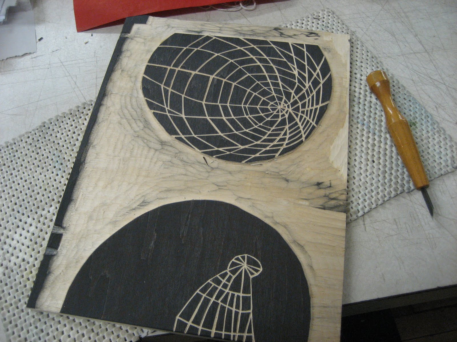
The layered printed type wasn't enough to create the feeling of a sea. It was clear that I couldn't rely on the type alone to create the image. I decided to use woodcuts as another element in the print. I have done a lot of woodblock printing, and often use a very high quality wood in my work, but in this case, I wanted the texture of the wood to be a prominent part of the print. I found a few discarded pieces of wood that were perfect for the project. I cut them down on the table saw, transferred my image in reverse and carved.
Shellacking the woodblocks.

Drying. The sea is on the left, the pour is on the right.

Proofing..
Whenever I mix processes (in this case woodtype and cuts with woodblocks) I build in plenty of extra paper for proofing.  The only way I can see if the color is working and the registration is correct is to pull a proof. The end results of the make-ready are always interesting, even though they are "wrong". I often have a hard time recycling them when I am done...so I always hold onto a few of the most unique proofs. Space 1026 has coined the perfect word for these prints: Super Rare.

Blue, my favorite color. It always has been.
The t,c, and h: in lock up.
I used the grain of this low-grade plywood a foundation texture for the print.
Reduction carving created a new layer of texture (and gave me a blister).
Detail of the sea, created with the many layers described: type, broken type, plywood and carved wood.
Proof reading and fixing errors in the colophon. The "1" and "l" of Gills Sans are remarkably similar.


Below is the final version of my print titled: "ou", 2012, 24 x 14 inches


I have participated in many exchanges over the years, and it always reminds me of the comforts of school--where someone else sets the parameters and gives you the assignment (deadline included). I was particularly pleased with the results of this print. In the end I have a piece that really feels like my work, but I am sure I would have never arrived at this piece, had Tricia and Ashley not handed me the materials. It is also very interesting to see the variety of work that the other participating artists produced, despite the fact that were were working within the same parameters. You can see the final prints from the exchange and read about the process at www.vswtp.org.

Wednesday, January 25, 2012

Wallpaper Project: In the Background

I was invited to participate in a portfolio exchange for the 2012 Southern Graphics Council Conference in New Orleans. Yoonmi Nam was the organizer for this exchange and the following folks are participating: Kristi Arnold, Laura Berman, Teresa Cole, Christa Dalien, Kristina Estell, Adriane Herman, Mary Anne Jordan, Mari LaCure, Serena Perrone, and Nicolette Ross.

Yoonmi Nam wrote this narrative to describe the theme of this exchange portfolio:
"In The Background exchange portfolio will be a tribute to our decorative and commercial printmaking history. The styles, patterns and the subject matters depicted in each print reveal how we locate ourselves geographically, socially, culturally, and historically: where we live, where we came from, and where we want to go.

Often in the background, the use of wallpaper throughout history has been of an ephemeral nature. Whether it was used to transport ourselves to a picturesque French landscape in our own living rooms or to cover and conceal what lies underneath, wallpaper has the ability to create a mood and atmosphere. As styles changed over time, so did the coverings on our walls.

Artists will make their own wallpaper designs based on their diverse interests and backgrounds while addressing the culture of this man-made environment and the potential transformation of an interior space. Using both conventional and unconventional subject matters, each print will be a sample wallpaper section with the potential to expand to become a continuous pattern. The completed portfolio could resemble a high-end wallpaper sample book providing a sense of potential to be used as wallpapers, and at the same time, each print will be able to stand alone as an image."

For those of you who are not aware of the tradition of exchange portfolios, in addition to a theme, there are rules regarding paper size, image size, orientation, etc. The rules for our particular exchange included: The print can be any print medium, printed on any 2-dimensional surface that measures 20 x 27 inches. The print must have a bleed image with razor cut edges, however the pattern could be horizontal or vertical. The edition size is 14. The final prints will be bound into a large wallpaper sample book.

I am currently working at Wells Book Arts Center have been surrounded by amazing letterpress cuts. While I am drawn to these cuts for their aesthetic and nostalgia, I think that it is interesting that they are essentially old-fashion clip art. I wondered if I would be able to transform the cuts into a larger wallpaper piece, using this "clipart" as an essential element in the design. I began by printing many, many images and was drawn to a print I made that mirrored the image of one of the landscape cuts. The concept of of creating a false landscape that would potentially wallpaper an interior space was interesting to me. I began to work with the printed image in Photoshop, combining it with a few other printed cuts to design my wallpaper pattern.
Piles of cuts from the basement of Wells Book Arts Center.

Some of my printed images that were used in the wallpaper pattern.
On the surface of each piece of paper that I would edition the pattern one, I painted a combination of watercolor, animal skin glue and alum, and then printed the grain from a large piece of wood.
I had to run several tests to make sure I had the correct exposure time and washout before I could make the final 23 x 10 plate.
I did not have a platemaker, so I did the washout of the polymer plate by hand.
Lovely grey ink.
Pin registration, stencil, and polymer plate used in printing the pattern.
More than half-way done.
Close up of the pained paper, printed wood grain, and printed polymer.
Final wallpaper print, 20 x 27, watercolor, woodblock, and polymer.

Sunday, December 11, 2011

Making Paper at the Women's Studio Workshop

The Beater at Women's Studio Workshop
This year I received a studio residency grant from the Women's Studio Workshop. It is an opportunity for me to use the studio space to create a new body of work. I arrived at WSW prepared to begin by pulling an edition of handmade abaca paper. I had made paper before--in Japan (2003) and in graduate school (2004), but both times professional papermakers facilitated the process.

In 2008, I came to WSW for the first time on an Artist's Book Residency to edition my artist book, Treasure. I had decided to make the paper for this book--it was the first time I had made paper in such a serious way. I had two excellent papermakers assist me with the process: Mary Tasillo and Michelle Wilson. They spent the week with me, beating the pulp, pulling sheets of paper, and coordinating the drying process. The book I made had ten folios and was an edition of 36. Together we pulled hundreds of sheets of paper for the project.

This time, I was facing the process of making paper on my own. Thankfully Chris Petrone, one of the permanent staff members of WSW, was able to help me figure out the quantity and the time for beating the pulp. She also talked me through the aspects of pulling, couching and drying the paper. Chris was graciously available to answer my questions late into the evening.


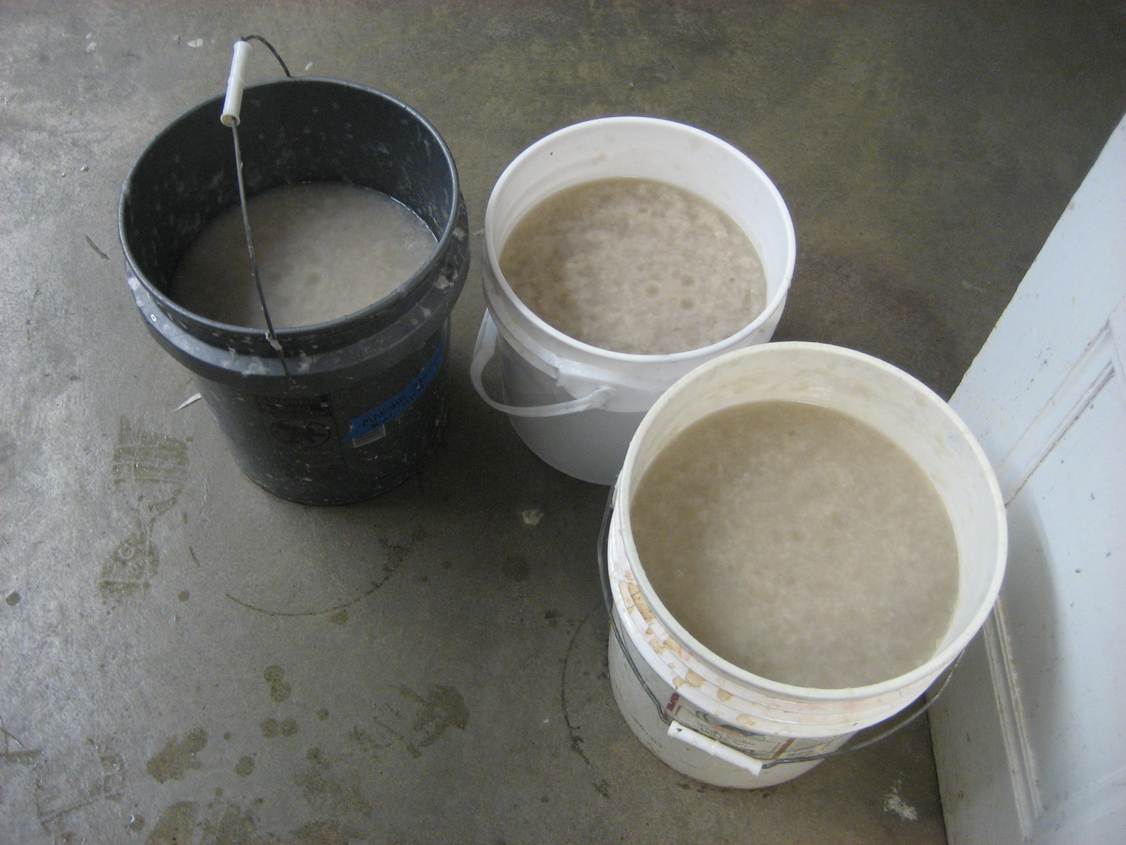
Draining the pulp from the beater.
Pulp!


Making paper is like many of the other technical processes I am attracted to. On one hand, it's so simple: beat pulp, mix with water, use screen to pull thin layer of pulp from vat, dry on board: paper! Yet the craft of pulling a sheet of paper--and I mean a good sheet--is really difficult. And the only way to learn it is by doing it, a lot. When I started, I was simply thrilled with myself for pulling a sheet of paper! However, the more sheets that I pulled, the more I began to notice when the pulp was uneven, or that I had jostled the mould and deckle, or that the pull was too thick, or too thin. As I became more sophisticated in my knowledge of the process, I began to have a clear understanding of how clunky I was at this craft.
Occasionally, I could get it just right.
To couch: a verb, not a noun.
After the paper is pulled, the water has to be squeezed out of it.
Then the paper dries between blotters and boards over night.
Paper!
This is the beginning of making a new body of work. I am surprised to find myself so intimidated by this stack of blank handmade sheets.


Monday, November 14, 2011

The Bixler Press & Letterfoundry

Letterpress broadside by Michael and Winifred Bixler, 2011, 26 x 18 inches.
For the next two years, I am interning once a week at The Bixler Press & Letterfoundry in Skaneateles, NY. Last summer, Michael and Winnie designed, wrote, cast the monotype for this incredible broadside. The decorative border is also monotype cast and hand-set by Michael. At a closer look, you will find that the border is symmetrical, but it doesn't repeat. It shifts, changes, evolves as the pattern works its way down the sides and across the top and bottom of the print. This is accomplished by a careful rotation of a variety of decorative 24 point cuts. It is absolutely lovely.

The other impressive aspect of this broadside is that it was written and designed in type. This represents Michael's extensive knowledge about the history of typography. But more impressive to me: it wasn't formatted on the computer. It clearly demonstrates Michael's understanding of the physical space in typesetting. He knows how much line and leading space is available, how much room each letter takes up. The result is something that is at once beautifully designed, informative, readable, AND everything fits on the page. I think that the reality of the physical limitations of type is really hard to wrap your head around unless you have set type in this way. The computer gives such a false sense of typesetting--the computer is far more flexible and forgiving.

When I began my internship in October, Winnie showed me the finished print along with the border, which had sadly, been pied. Last week, I re-set the border so that Michael can expand it for another broadside he intends to print on the Heidelberg Press.
Nearing the end, the border is almost re-set.
I had to refer to the printed broadside as I re-set the 24 point (and smaller) patterned cuts.
Detail of the pattern border set in lead.
Detail of the pattern border printed on paper.


Wednesday, September 14, 2011

Center For Book Arts Fellowship

In 2010 I began a weekly commute to New York City as the Stein Family Scholar at The Center for Book Arts (the Center). Throughout my year at the Center I had the opportunity to take several workshops and classes. My two favorites were Barb Tetenbaum's Artist Book Strategies, Exploring Music and Musical Scores and Paul Moxon's Vandercook Maintenance Class.
Two of my drawings from Barb Tetenbaum's workshop at the Center.
In addition to taking workshops, I was given access to materials, the printshop, and the bindery in order to develop a book related project. The timing of this project coincided with the year that my daughter left home to attend her freshman year of college. It is the first time in my adult life that my responsibilities of parenting have dramatically shifted because my daughter has moved away from home. Her departure offers me (as a single parent) more freedom to take advantage of residencies away from home, like the one at the Center for Book Arts. In addition to this, it is also a year of great change for me as a parent--a turning point. I know, I know--using the emotions of an "empty nest" as content for artwork is absolutely dangerous. However, I feel I can express a particular point of view regarding parenting. I used my time at the Center for Book Arts to develop text and imagery that express this point of view. It has been an important time for me to investigate the telling of this story. 

Because my time at the Center was limited to one day a week and included a 4 hour commute round trip, I decided to work with these constraints: I wrote and sketched on the bus, directing my writings toward my memories of raising my daughter. As I began the editing process, I discovered that many of the memories were strongly linked to place. And over the years Helen and I have lived in many, many places. The books I made during the residency as the Stein Family Scholar are a collection of writings based on places we have lived, taken from the years 1995, 1999, 2001, 2007, and 2010.
My inking station at the Center for Book Arts.

One of the reduction woodblocks used to print the imagery for "The World, 1995". I used a kento registration system, even though I printed with oil based inks on an etching press.

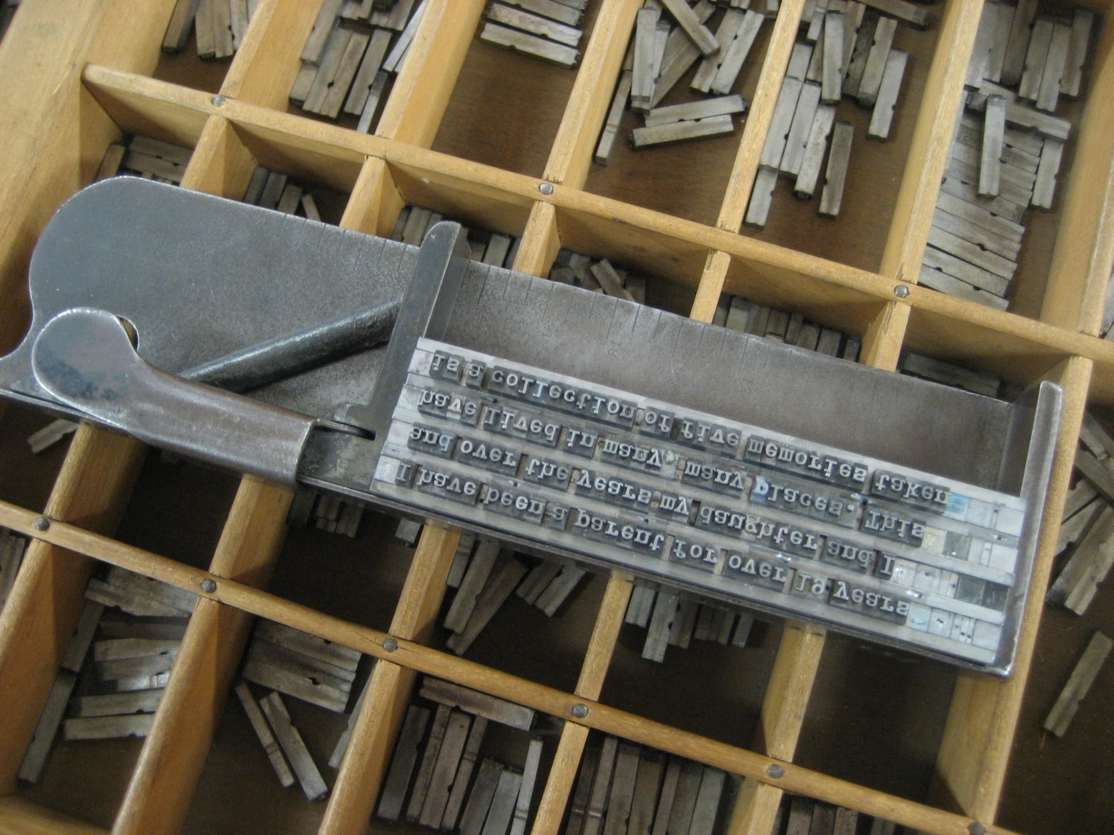
Setting type for the colophon.
One of the reduction woodblocks used to print the imagery for "Three, 2001".
Woodtype used for printing the titles on the covers.

I printed and bound these works at The Center for Book Arts, in New York City, during my residency as the Stein Family Scholar for Advanced Study of Book Arts from the fall of 2010 to the summer of 2011. The images are made up of reduction woodblocks printed on a Charles Brand Etching Press. The type is handset in Spartan Black Condensed 36 pt., Bulletin Typewriter 24 pt., & Remington Typewriter 12 pt., printed on a Vandercook No. 4. I will be posting complete images of the text and interior of this artist books on my website.
In the bookpress.


Five very short stories from 1995, 1999, 2001, 2007, and 2010.


Thursday, August 25, 2011

Japan Broadside

Letterpress broadside by Katie Baldwin, 2011
To help fund my trip to Japan I created a letterpress broadside. To develop the text and imagery for this broadside, I combined an excerpt of text from one of my artist books and imagery from one of my mokuhanga prints. The text and imagery for the broadside is printed from polymer plates made from an ink drawing. The broadsides are hand colored and printed in an edition of 85. The paper size is 8.5 x 11 inches. They are available for purchase for $35 at my Etsy store.

The original text was written in 2004 when I traveled to Japan for the first time. The text was created for the artist book Treasure, which was printed and published at the Women's Studio Workshop. In its entirety the text reads:

                                         She had changed
                                         her name to Treasure.

                                         One Tuesday she made
                                         it legal.
                                         And on Wednesday
                                         she made it official--
                                         she would leave.

                                         Now looking back, she
                                         could not figure out 
                                         the actual
                                         moment when she did
                                         start over.

                                        This much she knows:
                                        it did not happen in the air,
                                        but here
                                        on the ground,
                                        where
                                        she
                                        landed.

                                       This land was made of fire.
                                       Fire.
                                       And she found it everywhere.

When I wrote this text I was thinking about how people are changed by their experiences in the world.  In this poem, the main character is changed by things that are both physical and tangible: the ground that she walks on is unstable and it affects her deeply. The imagery for this broadside was originally developed for a print I did in mokuhanga titled: Throwing Our Things In The River Below. I adapted aspects of the original print for this broadside because the whale emerging from the water created a visual analogue with the printed text.

This broadside began with the carving of the cloud shape out of linoleum. The linoleum was mounted on wood in order to make it type-high, locked up and printed on a Vandercook number 4.

Lock-up on the Vandercook. (Photo credit: Sarah Alfarhan.)
First layer printed in silver. (Photo credit: Sarah Alfarhan.)
Because the imagery was too large to print on my 9 x 12 magnetic base in one run, I had to print the image section by section. I made my own polymer plates from a series of ink drawings on frosted mylar.


Proofing the first polymer plate. (Photo credit: Sarah Alfarhan.)
Proofing the polymer plate is essential in making sure the position is correct on the page, the ink is consistent, and that the plate is creating the proper impression.

The four sections of the image are printed. Printing the text is next. (Photo credit: Sarah Alfarhan.)
I wrote the poem out by hand and from my own writing made the plate. The text was the final printed layer.
Final printed layer. (Photo credit: Sarah Alfarhan.)
After the final layer of printing is done, I am ready to hand paint the whale and the water. It takes a surprising amount of time. For me the printing felt much faster, while in contrast the painting was quite tedious. Fortunately/Unfortunately, I lost track of how many Battlestar Galactica episodes I watched.

My painting station at the Vermont Studio Center.


Sunday, August 14, 2011

Naoshima

The day before I left for Japan, I met Sarah Suzuki, Associate Curator of Prints and Illustrated Books, Museum of Modern Art in New York, at the the Print Center's 85th Annual International Competition in Printmaking. She had suggested that while in Japan, I make my way to Naoshima, an island located on the Seto Inland Sea.

Mariko, Yoonmi, Helen and I started our journey on the SHINKANSEN!


From the Shinkansen, we switched to a smaller, slower train. And then again to an even smaller, even slower train. And then to a ferry. And then to a bus. And finally, we found ourselves traveling by foot on the island in a lovely mist of rainfall.
From front to back: Mariko Jesse, Yoonmi Nam, Katie Baldwin, and Helen Blue
On the island there are were several sight specific artworks. We took our time walking along the beach, climbing over, under, and through the sculptures. Not many people were on the beach and it seemed that we had the artwork and this Japanese island a bit to ourselves.

Kelen and Hatie (or Katen and Helie?) inside an installation on Naoshima. Photo credit: Mariko Jesse
My favorite sculpture was "Pumpkin" by Yayoi Kusama.
I know I am not alone in liking it so much. The color, the scale, the pattern, and the location
make this artwork so perfectly likeable.

Helen, Mariko, Katie and Yoonmi posing with the pumpkin. Photo credit: Mariko Jesse.

Naoshima is particularly known for its contemporary art museums. The Chichu Art Museum and the Benesse House were both designed by Tadao Ando. The Chichu Art Museum houses a number of contemporary art works that include James Turrell and Claude Monet.

As we came to the wing of the museum designed for viewing the paintings by Monet, we were instructed to take off our shoes and replace them with the provided slippers. Shuffling in our slippers, we entered an unusually large and strangely shaped white room. The most powerful aspect of this room was its whiteness. I believe this room was meant to cleanse our visual pallet before we viewed the paintings. When I left the pallet cleansing room and entered the room with the paintings, I was overwhelmed by the presentation of the paintings and the space designed to house them. Instead of large gilded gold frames, these Monet paintings were framed in very large modern shiny white frames. The room was so large that the paintings seemed surprisingly small. And I just couldn't keep my eyes off the 1 inch square stones that made up the floor.

The works by James Turrell were particularly great. The art worked seamlessly with the architecture, light, location, and aesthetic of the museum designed to house them. We experienced optical and spacial illusions in the best way that James Turrell can deliver.

Yoonmi, Helen, Katie checking out "Open Sky", 2004 by James Turrell. Photo credit: Mariko Jesse.


No hotel for us: we chose to spend the night on the beach in a Mongolian Yurt.
Our yurt on the beach at night. Photo credit: Mariko Jesse.

Inside our yurt. Photo credit: Mariko Jesse